This is something I did way back when I was working for Top Cow... I think it's about 5 or so years old (I'm terrible at gauging time). Anyway it was for a book called Witchblade 1/2 which was some Wizard exclusive or whatever. You know, a lot of people have complained about Top Cow having a "studio look" that all the artsists copy or adhere to-- that's true. It was never something that any of the guys there (including myslef) were told to do, it's just that when Marc Silvestri would turn in pages everyone would go so nuts over them that we would ( without really thinking) want to emulate them. And then it becomes this unspoken pressure to have your drawings look a certain way. What made it all the worse ( and I do think this was the biggest problem in the studio system) was that the editorial department only responded favorably to artwork that looked similar to Marc's or Mike Turner's. And since we were all pretty much freelancers, we were all trying to impress the editors to get that next assignment. Now, I'm not trying to cut them down or anything because I learned a lot and had great time when I was there-- in fact I made some great friends at Top Cow that I still hang out with this day. And in the past few years, the studio has tried to expand their overall look or style. Okay, back to the cover-- The writer, David Wohl, asked me what I wanted to draw and I told him I thought it would be cool if she fought a bunch of dudes in a graveyard. And then I came up with this drawing ( I tried to put her in a body suit since I always hated drawing her almost naked). The story didn't take place in any graveyard but we all liked the image and that's how it stayed as the cover. Check out the link to the larger image here.
Tuesday, April 26, 2005
This is something I did way back when I was working for Top Cow... I think it's about 5 or so years old (I'm terrible at gauging time). Anyway it was for a book called Witchblade 1/2 which was some Wizard exclusive or whatever. You know, a lot of people have complained about Top Cow having a "studio look" that all the artsists copy or adhere to-- that's true. It was never something that any of the guys there (including myslef) were told to do, it's just that when Marc Silvestri would turn in pages everyone would go so nuts over them that we would ( without really thinking) want to emulate them. And then it becomes this unspoken pressure to have your drawings look a certain way. What made it all the worse ( and I do think this was the biggest problem in the studio system) was that the editorial department only responded favorably to artwork that looked similar to Marc's or Mike Turner's. And since we were all pretty much freelancers, we were all trying to impress the editors to get that next assignment. Now, I'm not trying to cut them down or anything because I learned a lot and had great time when I was there-- in fact I made some great friends at Top Cow that I still hang out with this day. And in the past few years, the studio has tried to expand their overall look or style. Okay, back to the cover-- The writer, David Wohl, asked me what I wanted to draw and I told him I thought it would be cool if she fought a bunch of dudes in a graveyard. And then I came up with this drawing ( I tried to put her in a body suit since I always hated drawing her almost naked). The story didn't take place in any graveyard but we all liked the image and that's how it stayed as the cover. Check out the link to the larger image here.
Sunday, April 17, 2005
I've been looking for this book on the web the last few weeks, without any luck. It's a French Disney Animation book. I've tried all the major book stores and used book stores (and Ebay, of course). Anyone out there have any ideas? Or does anyone out there have at and is willing to part with it. I'd be willing to do a trade with some original art or a commission piece. E-mail me if anyone's interested. Brianching1@aol.com
Saturday, April 09, 2005
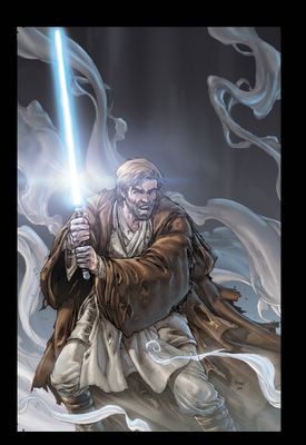
The colorist on the cover is Brad Anderson. He is such a TALENTED guy! I thought it was such a shame that no one ever got to see his amazing work on the cover so I thought I'd share it here. Check out all the rendering he did on the left arm around Obi-Wan's tunic. This is a perfect example of how a great colorist can define the mood of a piece.
Thursday, April 07, 2005
I spent all this time doing sketch cards for other people-- I decided to do one and keep it for myself. It's Luke from The Empire Strikes Back-- I always thought they had the coolest flight suits. Sorry again for the long delay between posts and hopefully I'll be able to post something new at least once a week.
Hey,
Sorry for the looooooong delay since my last post...things have been a little busy. I'll post more about it when those projects are finalized. In the meantime, here's one of those Heritage Cards I did for the Topps set a while back. I asked my girlfriend what she wanted and she said that little Ewok guy from Return of the Jedi. So here he is, done in pencil, sharpie, and grey markers for a little depth (unfortunately, my markers are drying out so this is kind of a rough look).