Poor Rakghouls and Gamorreans


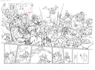
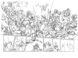
 Okay, here are the three versions of page 8-9 from KOTOR #3.
The first one-- the initial lineart is done. I send that one off to everyone for approval before coming back and finishing off all the rendering. Most important thing here is that I haven't left anything out of the script and that I haven't drawn anything inappropriate for print. You can see that I've done a little bit of the rendering on the Rakghoul and Raana Tay on the left. I work left to right anyways to help prevent smudges ( I guess lefties work right to left).
Once I get the okay from my editor, I render everything in a pseudo grayscale. The reason I call it pseudo is that I'm only going in to give it a little bit of form and contrast so that you can instantly tell what's going on at first glance. I can't do more than this on a deadline because a fully rendered page would take me a week to do and I just couldn't keep that up.
After that, I write up a bunch of notes for it (time of day, who's who, etc) and Mike Atiyeh colors the heck out of it. He really did a gorgeous job on this one.
My only regret here is that it is too short of a sequence. We seem to be running into that problem that we have too many good things going on with too many good characters. It's a good problem to have I know. It would be great if we could have more pages per issue.
-Brian

9 Comments:
How do you go about laying out something that complex? Do you do it small and the lightbox an enlarge copy? Or do you just go straight to the board doing everything full-size?
--David
holy shiz Brian, that is freggin awesome man. I love ur designs of the jedi. Just keep it comin', that's all I have to say.
Mark--
Thanks very much! Cool to hear you are diggin' the work.
David--
After I read the script, I do tiny thumbnails for each page. About 3 by 4 inches or so. I try and figure out the placement of all of the figures. For this one it was important to concentrate on Raana Tay and Lucien-- we should get a clear idea of how impressive their Jedi skills are. After I'm happy with the thumbnail, I eyeball it and transfer ir over to a full size bristol board. This one was a double page spread so the dimensions were 22 x 17 inches ( two 11x17 sheets taped together).
I don't like doing really tight thumbnails and lightboxing it over. I like that there's a chance of something new happening on the larger paper-- something I may not have seen when working on the thumbnail. I've heard other artists call this "happy accidents." It's just an attempt at trying to keep the prcoess spontaneous. Everyone is different but this seems to work for me.
Hope this makes sense and hope it helps too.
-Brian
It makes a lot of sense....
I am going to have to try out that method, lightboxing always leaves a very cold and traced feel for me according to my most recent portfolio review and rejection letters....
Thanks again for all your answers...
-David
I really like the way this one turned out. Great job!
What's going on with Lucien's face in the middle-bottom panel?
I also really liked the spread on pages 2-3. It's a simpler one, but the shapes and the coloring are really beautiful.
-Evan
"The first one-- the initial lineart is done. I send that one off to everyone for approval before coming back and finishing off all the rendering."
How long does that take? Even before finishing off, it must be slightly irritating to be told to start over if the page is disallowed?
Evan,
Lucien's face is in shadow. It's kind of a graphic image -- where the head is all blacked out and only the eyes are visible ( we see that in Batman all the time) --that usually works out okay in ink but I guess not so well in pencil.
Ah, ok, I thought it must be something like that. It does look a little odd, but I wouldn't say it looks bad or anything.
Looking forward to KOTOR #4!
-Evan
Post a Comment
<< Home