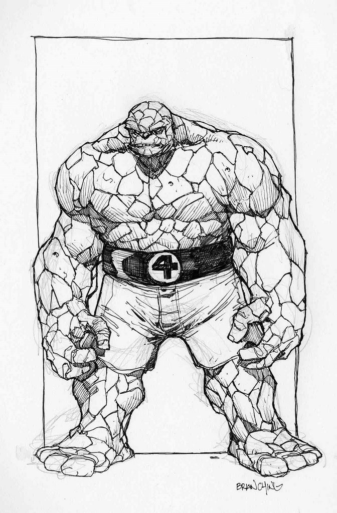
The Thing
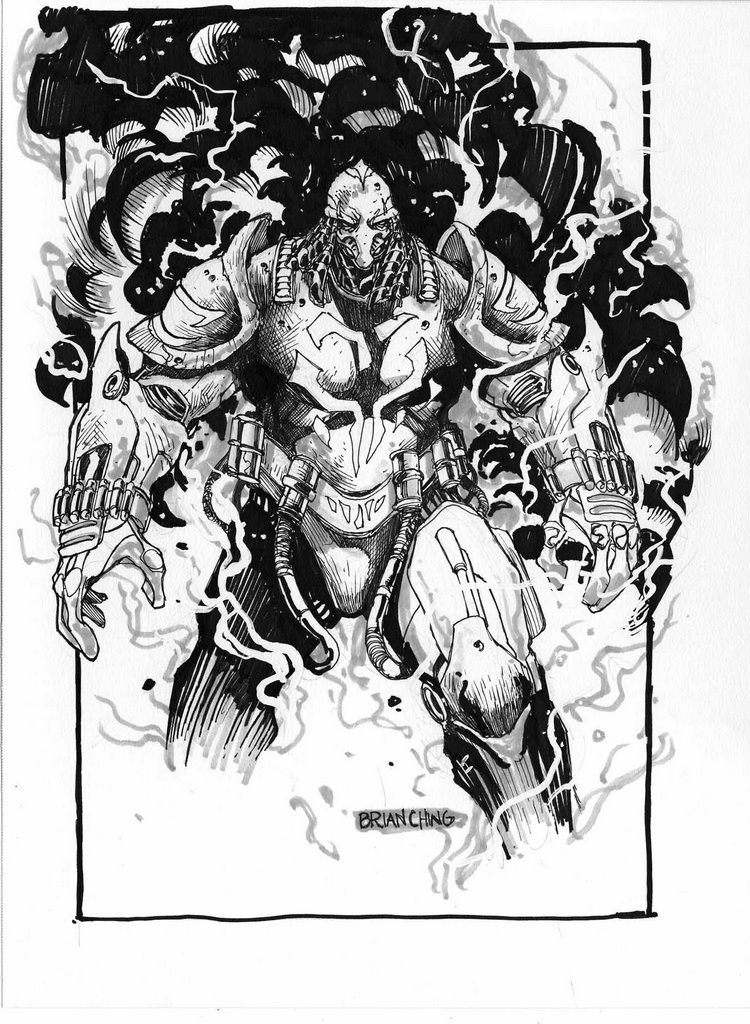
 Just doodling in my sketchbook and came up with this. My first experience with comics was in the 80's and my brother driving me around to local liquor stores and 7 Eleven's to check out the comic book racks. The stuff I liked the most was John Byrne's run on Fantastic Four and X-Men. I loved the Thing but hated how he always got his butt kicked by every other muscle bound character in the Marvel Universe.
 Also, it's fun for me to draw non Star Wars characters every so often.
-B
posted by BrianChing at 4:42 PM
2 comments
![]()
![]()