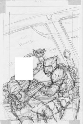
KOTOR # 8 Cover-- part 2
 Here's the next step in the penciling process. I've begun roughing in the basic anatomy and starting fleshing out some of the details like pouches and weapons. This stage of the drawing is done very quickly and I'm acting mostly on instinct here. That way the drawing stay somewhat spontaneous and I get that energetic line drawing I'm looking for.
BTW, for those who have read #6, I'm sure you figure out who "sketch-man" really is, right?
-B

12 Comments:
Ok, ok. NOW I can tell who "Sketch Man" actually is. Drat! There goes my idea for the whole independent "Sketch Man" comic-book pitch. ;)
Seriously, though...love the design. I like the way the blade points to the other's face, and the "x" of the locked arms below points up toward the Mando's helmet and is echoed by the "x" of the legs. I'm sure this was all carefully mapped out. ;) (I got a cert in science illustration and I remember when we got together to review each other's work, and people would say, "I love how you did this thing with the layout" and the person being critiqued would be going: "Thanks...er...I didn't even notice I'd done that!"
Anyway, great and dynamic layout. Can't wait to see it colored!!!!
- Carolyn
Hey thanks for showing all the cool artwork Brian.
I love to see how the covers develope.
Question? When do you get the biggest thrill!
Thumbnail Sketch
Inked or Fully coloured.
Also when you begin do you have the colours in your mind or do you just leave all that to Mike?
Thanks Jamie G
That pretty cool showing us the cover...but...m why hidding the identity of the left person is such a big deal ^_^
Btw Carolyn look a picture in the previous posts...the cloths are pretty much the same as Zayne.
Hey Carolyn,
Haha, I wish I could say all those Xs are planned but it's not so. True, a lot goes into the overall design and comp of the drawinng but sometimes we just get "happy accidents."
-B
Jamie--
That is a really good question. Hmmm, the layout is the most difficult and challenging part of the drawing, for sure. Also the most rewarding as well, because your really using your creativity there. Once the layout is set the drawing is mostly grunt work. The drawing is the part where I can put on my headphones or have my Arrested Development DVDs on in the background. It's still fun but doesn't require as much concentration as the layout part.
I think the most exciting part for me is when the colors come in. Mike and I talk about things like time of day and who's who or what props may be present. After that Mike does his thing and I'm always blown away afterwards.
-B
I'm hiding the cover a little bit because Dark Horse hasn't officially released the image yet and I'm not supposed to show things until they do first. I'm already pushing things by showing these layouts.
-B
What are those dark grey bits in each corner?
That's drafting tape-- this is actually a sheet of tracing paper.
-B
Oh. May I ask why? :)
After laying out the initial rough, I put a sheet of tracing paper over it and refine the rough drawing. The reason the tape is showing up as grey is because I've scanned it as a greyscale image to keep the file size smaller.
After that, I lightbox the tracing paper version to get a clean final image. The images need to be as clean as possible since they aren't actually inked, just scanned and tweaked so that the colorist has a clean file to work with.
Thanks :)
Thanks :D
Post a Comment
<< Home